Hey all,
My name is Charles, and this year I made the move from my
beloved (though useless) Tomb Kings into a High Elf army. Rich has invited me
to make a blog post, showing off my progress on my army to date, and talking
about my thoughts and techniques along the way. I decided for this, rather than a simple presentation of the army, to talk about the path that led me to paint them the way that I did.
Let’s begin by talking about my
background. I did the Warhams when I was a kid, and then did the usual “turn
18, panic about girls, sell Warhammer” thing that so many of us do. Then back
when I was in first year of University, back in 2010 or so, I found myself
slowly drawn back in. First it was Bloodbowl. Then Battlefleet Gothic… and
before I knew it, I had some Orks. Then a lot of Orks. So, so many Orks.
I went through a Space Marine army as well. My painting
style, through all of these armies, was one that emphasised clean lines and
neatness, with over the top highlighting as standard.

When I started playing Warhammer Fantasy (aka The Great
Game), I very cheaply acquired a lot of Tomb King models, sold to me by players
who manifestly couldn’t handle the book’s sheer awfulness. This army had much
less complicated painting than my Orks, focusing on drybrushing for many
elements, but I kept the heavy metal highlights as I wanted to give it a bronze
age feel of spears glinting in the sunlight. (Though spears on skeletons is a
terrible choice, so I naturally sold those models on.)
I kept expanding this army, with many of the constructs
finding their way in, but I never really won all that many games. I took two
Best General in Race prizes with them, and generally had a lot of fun with
them, but their rules just drove me insane. I keep getting asked whether I will
return to them, now that the Undead Legions rules are available, so perhaps
their time will come again.
So this brings us onto the High Elves, the ostensible point
of this tract! A friend was kind enough to simply give me the Island of Blood
models, which would form the core of my collection. When I set out to start
painting them, I first stopped and did some colour theory. Now, explaining the
ins and outs of colour theory is a bit beyond the scope of this work, but there
is a very good series of articles on it over on this other blog: http://theback40k.blogspot.co.uk/p/color-theory-archive.html
.
After reading up on colour theory and comparing it to my
models, I had identified an issue with my Tomb Kings: the colours I used were
actually a fairly poor choice. In short, the purple didn't provide enough of a
contrast with the overall orange/yellow colouring of the models to really make
it stand out. So with the High Elves, I decided from the get go that my colours
would be ones that would make a solid overall impression. I would use red as my
primary, most important colour in the army. When people looked at it, they
would see red. I chose orange as the colour that would accompany the red, would
be the next colour in the overall effect: in colour theory terms, it is a
harmonious colour with red, so they would look natural together. To provide the
contrast colour, and give me colours to break up the red and the orange, I would
use blue, in a wide variety of hues and saturations: silvery metal, bright blue
gems, white cloth. All of these correspond to a blue, especially with the
correct base colours. Things like skin and wood don’t stand out to our eyes –
they look ‘normal’ and so are ignored – but these colour choices would define
the overall look of the army.
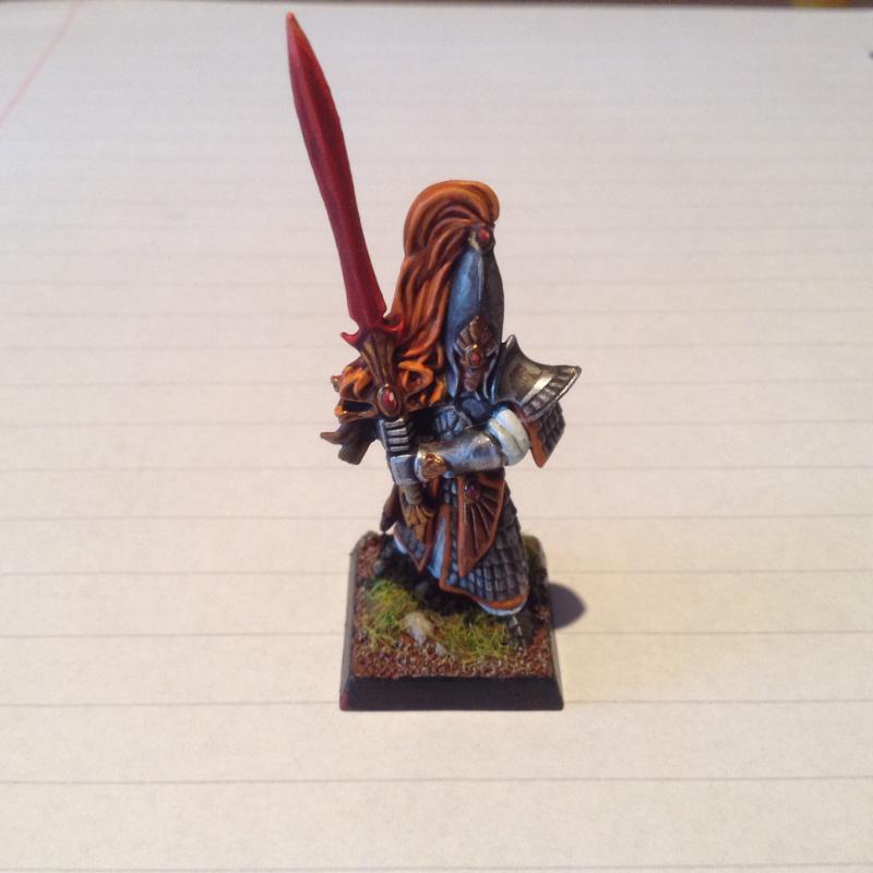
I decided to be particularly daring, and actually use red on
the weapons of my models. Instead of holding aloft silver swords, these two
Swordmasters – my first test models – hold red ones. This is both fairly
surprising to the eye, which is expecting some kind of a metal, and also
visually striking from a distance. The intention was to impress viewers who
were standing 3 feet above the models. But it wasn't quite striking enough for
my taste, not just yet; the finishing touch was when I (upon a friend’s
recommendation) added some orange to the tip of the weapon.
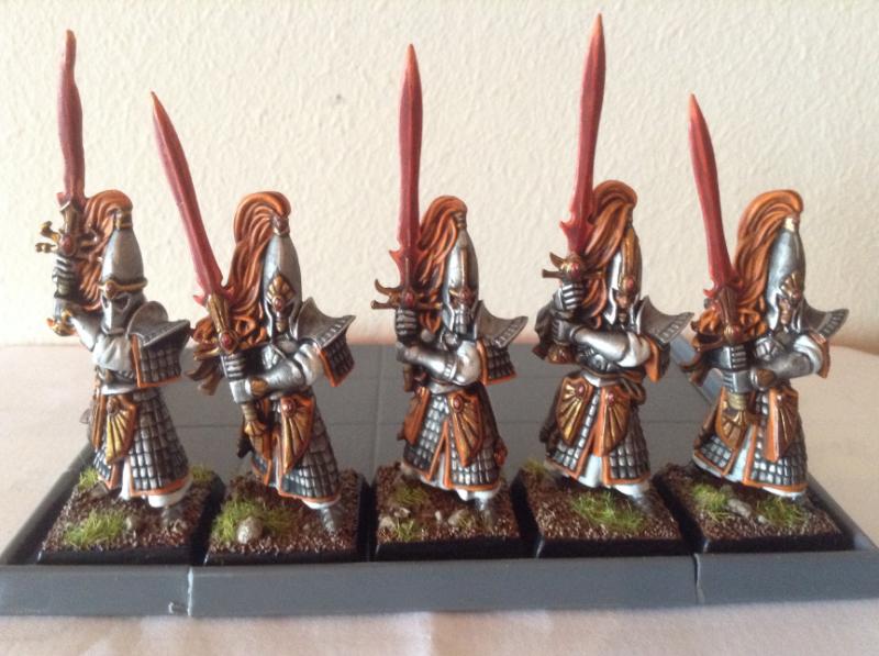
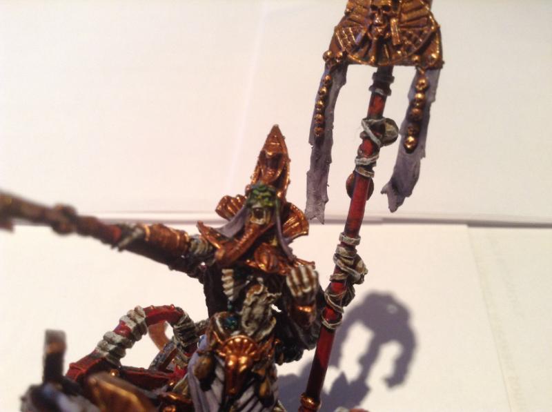
Here we see the overall
effect of my theorycrafting. We also see why you shouldn't use a gas hob to straighten bent swords! Orange has become the dominant colour instead of
red, which is used only on the most impressive part of the model. Here you see
red gems, which I later changed to blue in the service of providing more
contrast to the gold that always surrounds the gems on my models. White and
silver, both painted in ways that don’t distract away from the bright red and
oranges, round out the overall look. With the theory satisfied, and some test
models completed and approved by my clubmates, I started the slow road of
painting the army.
Thanks for reading this blog post, and next time we will be
looking at how I progressed from the simple Swordmasters onto more complex
units such as the Dragon Princes, Seaguard and Griffon. You can find me on
Twitter, using the handle @Charlesrampant. Until next time!
No comments:
Post a Comment